Interaction Research

Users: Researchers from a range of disciplines

Required: Users required to submit short/full research papers in order to attend conferences and guests also

must pay a fee

Registration process: 1 author – each paper, Guests may register for conferences inc social event,

  • 1 author – each paper
  • guests may register for conference and social event
  • fees: Authors and guests £120 and students £80

Requirements of the app based on above knowledge and taking into account security aspects in relation to user interaction and user experience design.

  • Emphasis on the clarity of information throughout the app
  • Speed of data input so save boredom / frustration of users
  • Sectional Display – Easy to navigate and can be carried through from the Mobile app to the Web Application.
  • Using ony what is important and what is required to make the interface cleaner for users and so they can find exactly what the need.

Important elements to consider:

  • Security- Photo ID verification (Passport,Driver License and or student card only) , Email Verification and fee paying card verification to help prevent manipulation of the software
  • Sectional Display: – View your submission, Watch Conferences, View public Chat, My votes, My Profile, and Settings
  • In the my profile section, the user can Edit their Name, and add additional personal details as well as submit an overview of their speciality field of research and other work related information which could work alongside the QR business card type lanyard.
  • A clean layout to enhance user performance
  • Relatable colour schemes

QR Codes

  • Quick Response code
  • A type of matrix barcode
  • First designed in 1994 for the automotive industry in Japan.
  • Machine-readable optical label that contains information
  • often contain data for a locator, identifier, or tracker that points to a website or application.
  • Became popular outside the automotive industry due to its fast readability and greater storage capacity compared to standard UPC barcodes.
  • Consists of black squares arranged in a square grid on a white background, which can be read by an imaging device such as a camera.

Lanyard Expansion

Possible interaction feature of lanyard

-vibrate

-light interaction( light colour change, flashing lights etc.)

-possible buttons

-Screen

-sound

Above are images of possible inspiration for the lanyards. Most of the users interaction will be with the interface itself, but the lanyard will also be an integral part of enhancing the users experience.

SOUND

The lanyard could have a speaking, enabling them to able to give audio of the even or even announcements.

Light

Lights could also be a way of notifying the user and make the experience more exciting

BUTTONS

buttons on the lanyards could be a way that the users will be able to set settings on the lanyard to what suits them. For example, adjusting volume, changing light setting etc.

NFC Tags

  • Near-Field Communication
  • Allows phones, tablets, laptops, and other devices to easily share data with other NFC-equipped devices.
  • Evolved from radio-frequency identification (RFID) technology. For example, RFID is behind those security scan cards that get you into the office.
  • NFC is limited to communication within about 4cm, which is why you have to hold your phone so close to the contactless reader if you’re using Apple Pay or Samsung Pay. 
  • Small radius is a major security benefit.
  • NFC can also transfer data like videos, contact information, and photos between two NFC-enabled devices.
  • An NFC tag can be used as an electronic identity documents and keycards. 

Engagement – Research

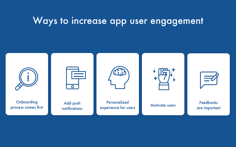
UX/UI Design will play an important role in the engagement factors of the interface.

1.Research

2.User personas

3.User behaviours

4.Design

5.Sketching

4.Wireframing

Engaging interface

Mobile App Engagement: Main Strategies To Keep Up With

————————————————————————————————————————————-

For a Interface to be successful it must be Valuable,Intentional, Intuitive and Invisible.

-In order for it to be valuable, It must be functional, and work how it is meant to work, there is no point having a interface that looks great but doesn’t do what it is intended to do, and makes things complicated.

-An interface that is intentional should be able to solve users problems not create them, it should work with the users, as the designers understand who the users are and what the intention of the app is for.

-A good designed interface that is intuitive means the user doesn’t have to think about how it works, and should be able to complete what they need to, easily. Designers need to know how the users will interact with the app, so they are not left questioning.

-An app that is fully functional and works to the users needs is 50% there, then to make it look appealing is the other 50% so it stands out in the competition.

We must create a page that will;

  • Keep users involved with the interface
  • Interactive and Compelling
  • Enable users to understand the functionality of the website and acheive their goal easily

To do this, we will

  • Navigation that is easy to follow
  • Keep the layout simple
  • use video and rich images
  • Have easy to read fonts
  • Eye catching colours
  • Embrace the white space, Less is more

Mood board

References

https://uxdesign.cc/the-power-of-good-user-interface-and-how-it-enhances-engagement-the-new-currency-in-the-digital-43a59bcd9bda

Phases of Developing an App

  1. Research
  • Initial analysis includes demographics, motivations, behavior patterns and goals of the app user.
  • Customers’ lifestyle.
  • Understand how the customer will be using the digital product (gives clarity).
  • Brainstorming what type of pages you might need.
  1. Wireframing
  • Helps to understand the functionality of the app.
  • Do quick sketches of the pages that might be needed in the app (helps to visualise what is needed).
  • Look at the ideas/sketches and link them up (i.e. click one button and where does it bring you).
  • Create a storyboard and flowchart of the final wireframing (shows how the user will navigate the app).
  1. Technical Feasibility Assessment
  • Is the initial idea of the app feasible technically? 
  • Consider app design and functionality on different screens (phones or tablets).
  • IOS and Android softwares have different requirements.
  • Review the idea technically and brainstorm solutions.
  1. Prototype
  • Create a rough draft of the prototype (to get the main concept across and visualised).
  • Can see if the app is too visually busy and cluttered.
  • Get feedback from people outside of the app development project (unbiased opinion).
  • Once prototype layout is finalised, then the design of the app can be considered.
  1. Design
  • How will the app flow and move?
  • Does it follow the brand’s visual identity (colours and font).
  • Is the design consistent?
  • Is it clear and concise?
  1. App development
  • Stage 1: core functionality of the app is created but not tested (app is very glitchy/buggy) – non-core functionality is not included.
  • Stage 2: most of the functionality is incorporated into the app and goes through light testing and bug fixing (still some issues present).
  • Stage 3: App goes through testing and fixing again before it is released.